The following slideshow controls have visual effect only.
ACU Prize for Poetry
Inspired by the Catholic Church’s long-standing tradition as a patron of the arts, the ACU Prize for Poetry has established itself as one of Australia’s most renowned poetry awards.
"To create works of art that bring us, in the language of beauty, a sign, a spark of hope and trust where people seem to give in to indifference and ugliness."
-Pope Francis, December 2016
Inspired by the Catholic Church's longstanding tradition as a patron of the arts, the ACU Prize for Poetry has become one of Australia's most prized poetry awards since its inception in 2013.
The prize has as its aim the simple goal of supporting the emergence of new and dynamic Australian poets and poetry.
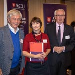
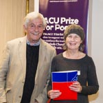
An initiative of our university's Office of the Vice President, the ACU Prize for Poetry receives hundreds of entries each year from across Australia.
The theme for the 2024 ACU Prize for Poetry is 'Faith'
"Faith is the strength by which a shattered world shall emerge into the light."
-Helen Keller
Prizes
First prize: $10,000 Second prize: $5,000 Third prize: $3,000
The prize is made possible through the sponsorship of the Office of the Vice President at ACU
Dates
Entries open: Tuesday 2 April 2024 Entries close: Tuesday 2 July 2024
Judges
Emeritus Professor Margot Hillel OAM
Margot Hillel is Professor Emeritus at Australian Catholic University. She has had a wide and varied involvement in the field of literature over many years including university lecturing in a range of literature fields. In addition to the ACU Poetry Prize for which she has been a shortlist judge since its inception in 2013, Emeritus Professor Hillel has judged many other literary awards including chairing the Young Adult and Children's Literature panels in the Prime Minister's Literature Awards, the Young Australian Writers' Awards, the Phoenix Award and the Crichton Award for New Illustrators. She is the joint editor of four collections of short stories, has co-written a number of books on aspects literature, regularly reviews books for a range of journals as well as publishing in scholarly journals. Emeritus Professor Hillel was awarded the Medal of the Order of Australia in 2000.
Professor Robert H F Carver
Robert Carver is Professor of Classical Reception and Renaissance Studies at Australian Catholic University. Born and raised in Adelaide, he graduated from ANU before travelling to the United Kingdom to pursue doctoral research at the University of Oxford. He returned to Australia at the end of 2020 to take up the position of Inaugural Director of the Western Civilisation Program at ACU (North Sydney campus). His academic publications include an Oxford Classical Monograph, The Protean Ass: The Metamorphoses of Apuleius from Antiquity to the Renaissance (2007), translations from the Latin writings of the twelfth-century mystic Hildegard of Bingen, and numerous scholarly articles on ancient, medieval, and Renaissance literature. In the field of creative writing, he has published poems and short stories in Australia, the UK, and the US. He won the under-26 section of the Mattara Bicentennial Poetry Prize, the Patricia Rappolt Memorial Prize (in conjunction with the National Short Story of the Year Competition, 1988), and was a finalist in the Newcastle Poetry Prize (2018). His poem 'Convocation' was Highly Commended in the Manchester Cathedral Poetry Competition (2020), while 'The Knock' will appear later this year in the Poetry d'Amour Anthology (WA Poets Inc.)
How to enter
Submit your entry using the online form below. The entry fee is $25 per poem.
Once you complete the entry form, you'll be prompted to pay online. Full payment is required for a valid entry.
Poems must not exceed 60 lines and each page of the document should be numbered. All poems will be judged anonymously and must not include the author's name.
Entries should be typed in Arial or Times New Roman font, size 12, and in the following formats only:
.doc or .docx
.pdf or.rtf
We will email you a confirmation of receipt and payment for your online entry. Postal entries will not be accepted.
Poems must be in English and be the original work of entrants.
Poems must be unpublished (including on any website or blog), must not have won any other competition, and must not be under consideration by any publisher or literary journal, or for any other prize for the duration of the competition.
Australian residents, including any international student currently studying at an Australian university, are eligible to enter.
ACU staff members (except the panel of judges) and ACU students are eligible to enter.
Entrants' names must not appear on any page of the work. Entrants' names should only appear on the entry form.
Entries should be submitted in Arial or Times New Roman font, size 12, and in the following formats only: .doc, .docx, .pdf, .rtf
Each poem must not exceed 60 lines.
Entry is only possible online. Entries will not be accepted by post, email or fax. All entries will be retained by ACU.
Entries open on Tuesday 2 April 2024 and the closing date for entries is Tuesday 2 July 2024 at 5pm AEST.
Multiple entries are permitted online. While each entry requires an entry fee, multiple entries may be paid for with one credit card transaction.
If entrants withdraw their entry, the entry fee will not be refunded.
No changes can be made to a poem once received by ACU.
Incomplete entries will be considered invalid and not be processed.
Valid entries cannot be withdrawn after the prize closing date of Tuesday 2 July 2024.
The judges reserve the right not to award the prize.
ACU reserves the right to quote extracts from poems, but not to exceed the 'fair dealing' provisions of the Copyright Act 1968 (Cth), in order to promote the ACU Prize for Poetry. This is separate from the licence you grant to ACU to print winning and commended poems in full on the ACU website, in ACU magazines and publications, and other promotional materials. Copyright will remain with the author.
Shortlisted entrants will be notified by email.
The winning, highly commended, and shortlisted poems will be announced on Tuesday 1 October 2024. Results will be published on the ACU website and may be published in external publications including newspapers, magazines etc. The winning and commended works will be displayed at the Awards ceremony, which will be held in Sydney on Tuesday 1 October 2024.
The judges' decision will be final and no correspondence about the result will be entered into.
Contact
ACU Prize for Poetry
Office of the Vice President
Australian Catholic University
PO Box 968, North Sydney NSW 2060
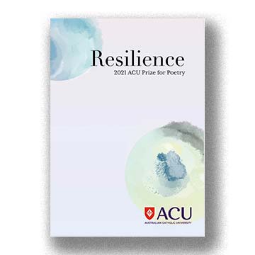
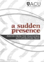
Purchase the 2021 ACU Prize for Poetry Anthology comprising the winning, highly commended and shortlisted poems. The cover art is by Joshua Yong, the winner of our cover design competition.
ACU Student Chapbook Cover Design winner - Naomi Thorpe
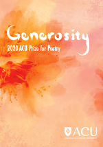
Generosity is the quality of being kind and generous, plentiful or large. To me, generosity invokes warmth. When I think of generosity, I think of my grandparents, the way kindness radiates off them, the things they do for me and the time they spend making food for our family. So for one of the main components of my design, I’ve used a photograph of blossoms from their garden. Not only do the blossoms carry a personal meaning, but their beautiful organic shapes facing outwards and branching out represent both giving and receiving.
Warmth - My design’s main focus was to be warm, so when creating the background artwork, I chose pinks, reds, oranges and yellows. I chose to work with warmness as my main aesthetic because when I think of generosity, I think kindness, I think the feeling people get from receiving kindness is warmth. The photos of the flowers have a colour burn effect on them, so that the shape and forms of the flowers would remain but they would be more embedded in the background, and produce even more warmth.
Loose - Working with inks and watercolour I wanted to give the design a loose feel, to express the abundance in generosity. The many colours blend into each other in a flowy way, and make the design appear unconfined. The title “Generosity” was made using an ink brush, to give continuity between all the elements. It also makes the word look more handmade which I thought would connect to the ideas of generosity better than if it were done with a basic font. I’ve made the G and y extend outward in the same curve shape, to further instill kindness, giving and receiving.
Humble - Another way generosity appears to me is giving even though you may not get anything in return, generosity is modest, and humble. For this reason, I have chosen to use an inconspicuous font, Futura condensed medium. This sans-serif font does not demand attention, and is simple and easy to read. Instead of using heading style or words all in capital letters, I have kept the design more innocent, and relaxing. White was the colour choice for the text because white is a symbol of purity, I felt black would be too dark and might imply a different meaning, and any other colour would not produce enough contrast to be read easily. In the inside cover, I’ve included an ink artwork made on very textured paper as I wanted the texture not to be so clean and smooth, but rather imperfect and non calculated.
To conclude, my ACU Prize for Poetry book cover design, includes elements that I believe reflect and echo the meaning of generosity. The warmth in not only the colours, but the overall mood and aesthetic are to provide the reader with the feeling often accompanied with a generous act, and the loose title and background to imply the limitlessness of generosity. To further my idea of generosity being kindness and occasionally self sacrificing, I have made the elements look and feel humble on the page, to show the purity of generosity.
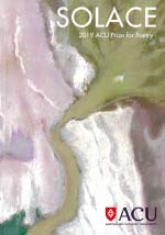
“The best remedy for those who are afraid, lonely or unhappy is to go outside, somewhere where they can be quiet, alone with the heavens, nature and God... I firmly believe that nature brings solace in all troubles.”- Anne Frank
My family and I lived 'on the road' for 14 years, pursuing our dreams. We experienced a unique way of sharing life together. We travelled in a Bedford motor home and nature was our back yard in which to explore, learn, play and rest. Special moments included discovering the ochre pits in Burt Plain, NT; driving through the lunar landscape of the Painted Desert in SA; visiting the central desert town of Yuendumu for the community sports weekend; swimming at Esperance WA after crossing the Nullarbor and sweeping red dirt out of everything.
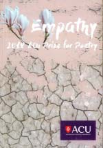
The Darling river was a favourite place to camp, and we returned there often. We would fish, catch yabbies and spend endless hours absorbing the country and the night sky. But we never made it to Lake Eyre, Kati Thanda. The Bedford couldn't take the corrugations! I heard it was filling up this year (2019) and poured over images in the newspapers, including satellite and aerial photographs. As we grieve the state of the Darling river system, the sight of Lake Eyre basin slowly filling, has become a very hopeful visual image for me. I drew on this inspiration when designing the cover of the ACU Poetry Prize book.
I was drawn to use chalk pastels because of their capacity to create a luxurious dusty texture and represent the salinity and the beautiful sand dunes that form around the lake. A sans-serif font appealed against the soft swirling artwork to add contrast and modernity. Solace is often experienced after enduring hardship. Observing Lake Eyre filling after devastating drought in many areas of the country, we can draw solace from this rare and life-giving occurrence.
It is quite easy to think this barren dry land is unsympathetic, however it is the line and shape working in unison to create the feeling of empathy. The fragmented pieces of earth are connectedby the jarring lines, crackling across the cover. Like the act of empathy, two people may be connected by a shared understanding and feel emotion for each other.
Balance, colour, grid
With such a busy image as the background, balance has to be maintained through simplified colour and grid. The main imagery has been relegated to the top left corner of the front cover, the text is aligned to the right. The only other content on the page is the authors' names and the ACU logos. The colours are quite muted and calming. The simplicity of the design allows for openness, for the viewer to bring their own understanding to it. The design maintains its integrity whilst also being able to hold many forms of empathy within its covers.
Texture
The dry heat, heavy dust and scorched earth is known well in Australia. We all feel the heat and dryness. The leached grey earth really contrasts the feeling of empathy, hence the splash of pale pink and white. This colour palette serves to sooth over the roughness. The typeface lends sincerity to the design because the feeling of it being hand written. It feels candid, like the word empathy was written personally for the viewer.
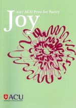
Joy is both an emotion and a state of being. We can feel joy in our everyday lives, or when we achieve a personal goal. I chose blue and green as background colours to represent the joy that nature brings to humanity. Many artists and poets have been inspired by nature, because of its beauty and spiritual qualities. The flower on the cover was inspired by the Aussie Rambler. This plant is native to Australia, so it can withstand tough weather and extreme conditions. I found this inspiring because although the Aussie Rambler grows in less than ideal circumstances, it still produces a beautiful, bright pink flower that brings joy to those who see it.
I drew inspiration from English 19th century book designers such as Talwin Morris, who often used a minimalistic colour scheme with large shapes and curved lines. The styles of this century often had a feeling of movement and expression to them, which is something that I wanted the flower to encapsulate. The freehand, slightly abstracted flower bursts from the serene background, creating a dynamic and exciting mood, which is how joy feels. I chose Plantagenet Cherokee as a font, because it is both classical and modern. Joy is something that all humans, past and present, have felt at some time in their life, so I felt that this transitional font encapsulated this notion well.
I used repetitive wavy lines on both the outer and inner book covers to show persistence through challenging times can have great benefit, and make us feel joy. A different type of joy, that is a daily choice regardless of circumstances is better represented through calmer colours such as cool blue and green. These colours are calming and serene, so they represent joy as a state of being. Orange was chosen for the wavy lines because it gives a feeling of warmth. I chose a faint shade of this colour to demonstrate the hard and often invisible work that goes on behind every great achievement.
My ideas on what joys is, along with the design principles and elements, have shaped the cover for this project. I hope these ideas are appropriate for ACU’s 2017 Prize for Poetry competition.
"It is crucial for all of us to give new meaning to the word ‘tolerance’ and understand that our ability to value each and every person is the ethical basis for peace, security and intercultural dialogue.
A peaceful future depends on our everyday acts and gestures. Let us educate for tolerance in our schools and communities, in our homes and workplaces and, most of all, in our hearts and minds.” - Federico Mayor, Director General of UNESCO from his address at the dedication of the Museum of Tolerance, Feb. 8, 1993
“Poetry, as the language of compassion, contrasts with objective and impersonal description and unfeeling reactions to tragedy. It can express empathy for what is too sad for words.” - Anthony Kelly
The poetic imagination seeks to draw out the “sacramental in the sensible,” to retrieve “the divine at the very heart of the least of things” (Richard Kearney). In this spirit the theme for 2012 is ‘everyday immanence’.
‘…what is usually unseen, and unspoken too – that, when it occurs, is what binds us all, since it speaks out of the centre of each one of us giving shape to what we too have experienced and did not till then have words for, though as soon as they are spoken we know them as our own.’ - David Malouf on poetry